
Color Schemes That Complement Sensa and Tan Granite Countertops
Choosing the right color scheme is an important part of creating a kitchen that feels cohesive, inviting, and visually appealing. Sensa and tan granite offer distinctive natural patterns and warm tones that can influence the appearance of surrounding cabinets, backsplashes, flooring, and fixtures. Pairing these surfaces with complementary colors helps highlight their natural beauty while establishing a balanced design. Understanding which shades work best can help homeowners create a kitchen that reflects their personal style.
Selecting complementary granite countertops also helps homeowners create a consistent look throughout the space while enhancing the kitchen's overall brightness and warmth. Whether the goal is a traditional, contemporary, or transitional design, coordinating colors can help bring all the elements together. Considering cabinet finishes, wall colors, and decorative accents alongside the stone makes it easier to create an attractive and functional kitchen.
Understanding the Natural Colors of Sensa and Tan Granite
Before selecting a color scheme, homeowners should consider the natural characteristics of their chosen stone. Sensa granite features distinctive patterns and natural color variations, while tan granite typically incorporates warm beige, brown, cream, and golden undertones. These characteristics make both options versatile enough to complement a variety of kitchen styles.
Sensa surfaces are available in various colors and patterns, depending on the specific stone selected. Some feature darker backgrounds with contrasting veins, while others incorporate lighter tones and subtle movement. Tan granite generally provides a warmer, more neutral appearance that pairs well with traditional and contemporary finishes.
Understanding these differences makes it easier to select coordinating materials. Rather than choosing colors independently, homeowners should consider the stone's dominant tones and use them as a starting point for the overall kitchen palette.
Pairing Warm Neutral Colors With Tan Granite
Warm neutral colors are a natural complement to tan granite because they reinforce the stone's earthy appearance. Shades such as cream, ivory, beige, and warm gray can create a comfortable atmosphere without competing with the natural patterns in the surface.
These colors work particularly well for kitchen cabinets and backsplashes. Cream-colored cabinets can brighten the room while maintaining a warm appearance, whereas beige walls can create a subtle transition between the cabinetry and stone. Warm gray also provides a little contrast without introducing an overly cool element.
Homeowners can incorporate these shades in several ways:
- Cream Cabinets: Create a soft, welcoming appearance that complements golden and beige undertones.
- Ivory Backsplashes: Provide a light backdrop that lets natural stone patterns stand out.
- Warm Gray Walls: Introduce subtle contrast while maintaining a coordinated color palette.
- Natural Wood Accents: Reinforce the earthy qualities of tan stone and add visual texture.
Using different shades within the same warm color family can create depth without making the kitchen feel overly busy.
Combining Cool Colors With Sensa Surfaces
Cool colors can provide an appealing contrast to the natural patterns and tones found in Sensa surfaces. Shades of blue, green, and cool gray can balance warmer stone variations while creating a distinctive appearance. These combinations work especially well in kitchens where homeowners want to introduce color without making the design feel overwhelming.
Soft blue cabinets can create a calming atmosphere while complementing lighter stone patterns. Navy blue offers a more dramatic option, particularly when paired with Sensa surfaces that feature white, gray, or beige veining. Sage green and muted olive are also attractive choices because they introduce natural color while maintaining a sophisticated appearance.
When incorporating cooler shades, homeowners should consider the overall balance of the kitchen. Darker cabinets can create visual depth, but lighter walls and backsplashes help prevent the space from feeling too enclosed. Combining different tones allows the natural stone to remain a focal point.
Coordinating Cabinet Colors With Granite Countertops
Cabinet colors significantly influence how granite countertops appear in a kitchen. Because cabinetry occupies a substantial amount of visual space, its color should complement the stone rather than compete with its natural patterns.
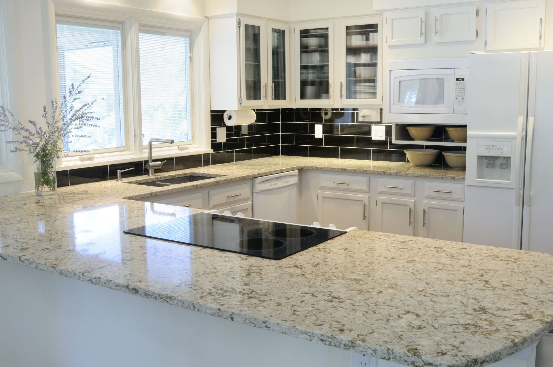
White cabinets remain a versatile option because they create contrast with darker granite and provide a clean backdrop for lighter varieties. Off-white and cream finishes work particularly well with tan stone because their warm undertones create a cohesive appearance.
For homeowners who prefer darker cabinetry, espresso, charcoal, and deep brown can provide an attractive contrast. These shades work especially well when the stone contains lighter veins or contrasting mineral patterns.
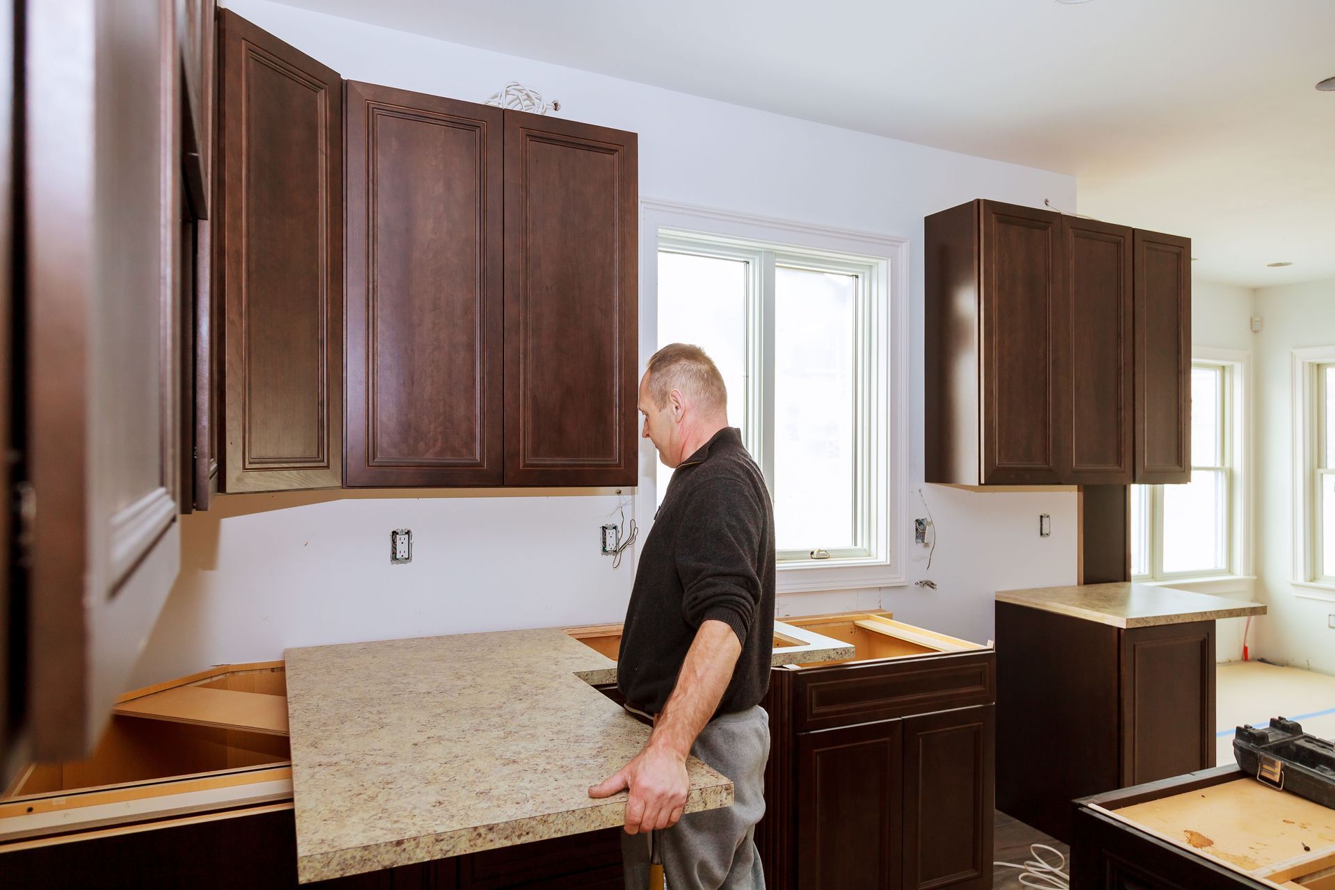
Two-tone cabinetry is another option worth considering. For example, homeowners can pair white upper cabinets with darker lower cabinets to create visual interest without overwhelming the room. This arrangement also allows the natural variations in the granite countertops to stand out.
Selecting Backsplash Colors That Complement Natural Stone
The backsplash is another important element to consider when coordinating kitchen colors. Because it sits directly above the countertop, its appearance can either enhance the stone or create unnecessary visual competition.
For tan granite, cream, beige, and light brown backsplashes can reinforce the material's warm undertones. Subway tiles in ivory or off-white provide a simple, timeless appearance, while textured stone tiles introduce additional dimension.
Sensa surfaces with more dramatic patterns may benefit from simpler backsplash designs. Solid-colored tiles or subtle patterns can help maintain visual balance without distracting from the natural stone.
Homeowners should also consider how grout colors affect the finished appearance. Matching grout can create a seamless look, while contrasting grout emphasizes individual tile shapes. Both approaches can work well when coordinated with the surrounding materials.
Incorporating Wood Tones and Metallic Finishes
Wood tones and metallic finishes provide additional opportunities to create a coordinated kitchen design. Natural wood introduces warmth and texture, making it an excellent complement to tan stone and many Sensa varieties.
Light oak and maple can create an airy, contemporary appearance, while walnut and darker wood finishes provide richness and contrast. These materials can be incorporated through cabinetry, shelving, flooring, and decorative accents.
Metallic finishes also influence the overall color scheme. Brushed brass and gold hardware complement warm granite tones, while stainless steel and brushed nickel provide a cooler, more understated appearance. Matte black fixtures can introduce definition and create contrast against lighter stone and cabinetry.
The key is maintaining consistency throughout the kitchen. Repeating similar finishes in cabinet handles, faucets, lighting fixtures, and appliances helps create a unified design.
Balancing Lighting and Color Throughout the Kitchen
Lighting can change how different colors and stone patterns appear throughout the day. Natural daylight may highlight subtle veining and lighter mineral variations, while warm artificial lighting can emphasize beige, brown, and golden undertones.
Homeowners should evaluate their chosen color combinations under different lighting conditions before finalizing their selections. A cabinet color that looks appealing in a showroom may appear noticeably different beneath kitchen lighting. The same applies to granite countertops, which can display different tones and patterns depending on the intensity and temperature of nearby light sources.
According to House Beautiful, 90% of homeowners prioritize countertops when planning a renovation, underscoring the importance of these surfaces to overall kitchen design. Choosing complementary colors for surrounding materials can help homeowners make the most of this important design feature.
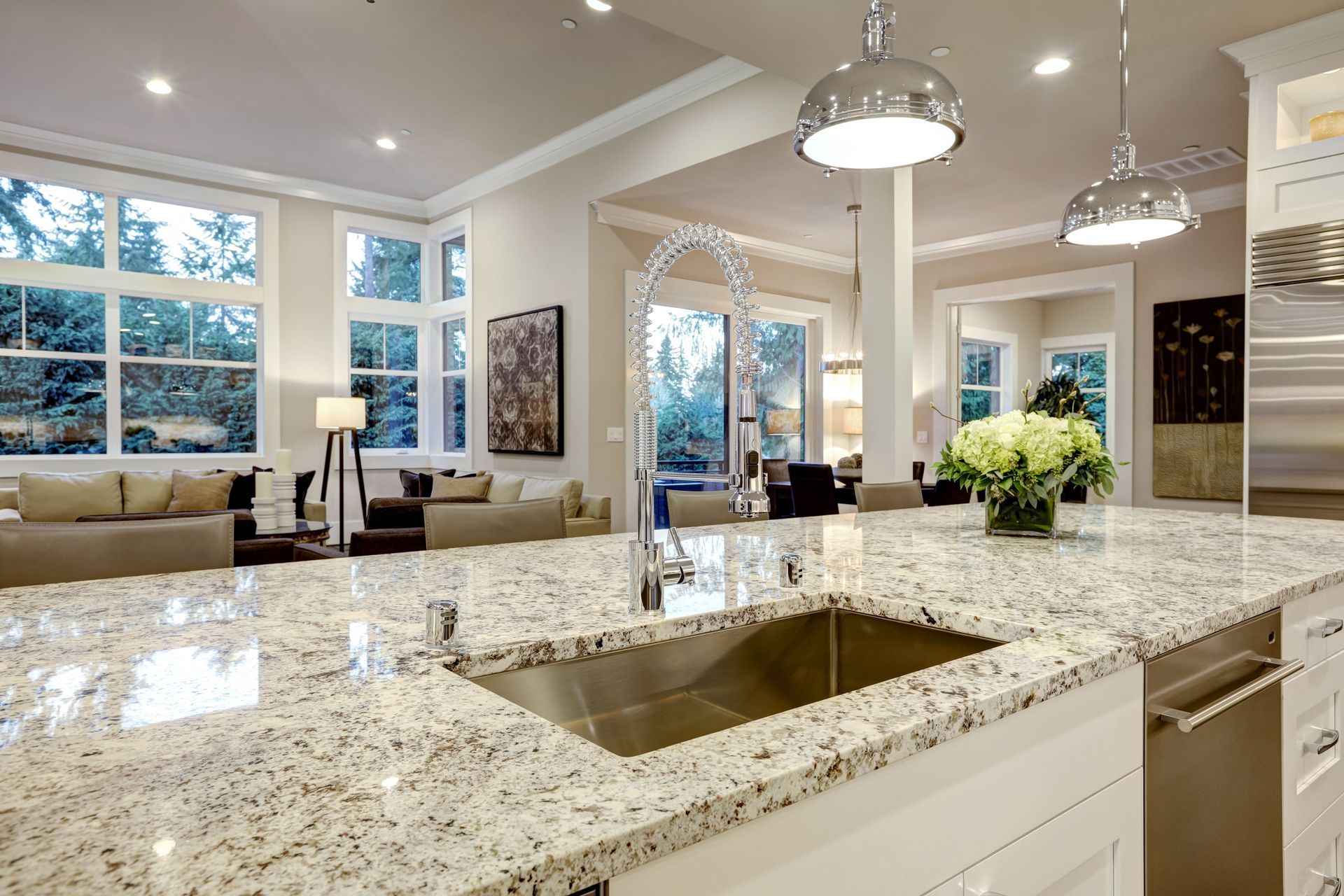
Under-cabinet lighting, pendant fixtures, and recessed ceiling lights can also help highlight natural stone patterns. Combining these light sources creates depth and makes the kitchen feel more inviting. Homeowners can also use dimmable fixtures to adjust illumination throughout the day, ensuring their granite countertops remain a focal point during both bright mornings and relaxing evenings. Carefully positioned lighting can bring out subtle color variations while helping cabinets, backsplashes, and decorative accents maintain a cohesive appearance.
Creating a Cohesive Kitchen With the Right Color Scheme
Selecting complementary colors for Sensa and tan granite involves considering more than individual shades. Cabinet finishes, backsplash materials, wood accents, lighting, and hardware all contribute to the finished appearance. By coordinating these elements, homeowners can create a kitchen that highlights natural stone while reflecting their preferred design style.
Legends Granite offers granite, marble, and quartz options, as well as custom countertop design, fabrication, and installation. Contact Legends Granite today to explore stone selections and find the perfect granite countertops for your kitchen.


Share On: